I’ve written a guide on how to perform this data analysis and generate the graph in the previous section. I am using the dataset from the city of Barcelona to illustrate the different data analysis steps.
After downloading the listings.csv.gz files from InsideAirbnb I opened them in Python without decompressing. I am using Polars for this project just to become familiar with the commands (you can use Pandas if you wish):
import polars as pl
df=pl.read_csv('listings.csv.gz')
Here are the cities that I used for the analysis and the number of listings in each dataset:

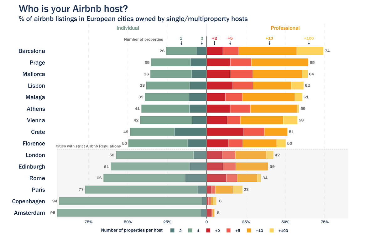
If you like this packed bubble plot, make sure to check my last article:
First look into the dataset and this is what it looks like:

The content is based on available data in each listing URL, and it contains rows for each listing and 75 columns that detail from description, neighbourhood, and number of bedrooms, to ratings, minimum number of nights and price.
As mentioned earlier, even though this dataset has endless potential, I will focus solely on multi-property ownership.
After downloading the data, there’s little data cleaning to do:
1- Filtering “property_type” to only “Entire rental units” to filter out room listings.
2- Filtering “has_availability” to “t”(True) to remove non-active listings.
import polars as pl
#I renamed the listings.csv.gz file to cityname_listings.csv.gz.
df=pl.read_csv('barcelona_listings.csv.gz')
df=df.filter((pl.col('property_type')=="Entire rental unit")&(pl.col('has_availability')=="t"))
For data processing, I transformed the original data into a different structure that would allow me to quantify how many listings in the dataset are owned by the same host. Or, rephrased, what percentage of the city listings are owned by multi-property hosts. This is how I approached it:
- Performed a value_counts on the “host_id” column to count how many listings are owned by the same host id.
- Created 5 different bins to quantify multi-property levels: 1 property, 2 properties, +2 properties, +5 properties, +10 properties and +100 properties.
- Performed a polars.cut to bin the count of listings per host_id (continuous value) into my discrete categories (bins)
host_count=df['host_id'].value_counts().sort('count')
breaks = [1,2,5,10,100]
labels = ['1','2','+2','+5','+10','+100']
host_count = host_count.with_columns(
pl.col("count").cut(breaks=breaks, labels=labels, left_closed=False).alias("binned_counts")
)
host_count
This is the result. Host_id, number of listings, and bin category. Data shown corresponds to the city of Barcelona.

Please take a second to realise that host id 346367515 (last on the list) owns 406 listings? Is the airbnb community feeling starting to feel like an illusion at this point?
To get a city general view, independent of the host_id, I joined the host_count dataframe with the original df to match each listing to the correct multi-property label. Afterwards, all that is left is a simple value_counts() on each property label to get the total number of listings that fall under that category.
I also added a percentage column to quantify the weight of each label
df=df.join(host_count,on='host_id',how='left')graph_data=df['binned_counts'].value_counts().sort('binned_counts')
total_sum=graph_data['count'].sum()
graph_data=graph_data.with_columns(((pl.col('count')/total_sum)*100).round().cast(pl.Int32).alias('percentage'))

Don’t worry, I am a visual person too, here’s the graph representation of the table:
import plotly.express as pxpalette=["#537c78","#7ba591","#cc222b","#f15b4c","#faa41b","#ffd45b"]
# I wrote the text_annotation manually cause I like modifying the x position
text_annotation=['19%','7%','10%','10%','37%','17%']
text_annotation_xpos=[17,5,8,8,35,15]
text_annotation_ypos=[5,4,3,2,1,0]
annotations_text=[
dict(x=x,y=y,text=text,showarrow=False,font=dict(color="white",weight='bold',size=20))
for x,y,text in zip(text_annotation_xpos,text_annotation_ypos,text_annotation)
]
fig = px.bar(graph_data, x="percentage",y='binned_counts',orientation='h',color='binned_counts',
color_discrete_sequence=palette,
category_orders="binned_counts": ["1", "2", "+2","+5","+10","+100"]
)
fig.update_layout(
height=700,
width=1100,
template='plotly_white',
annotations=annotations_text,
xaxis_title="% of listings",
yaxis_title="Number of listings owned by the same host",
title=dict(text="Prevalence of multi-property in Barcelona's airbnb listings<br><sup>% of airbnb listings in Barcelona owned by multiproperty hosts</sup>",font=dict(size=30)),
font=dict(
family="Franklin Gothic"),
legend=dict(
orientation='h',
x=0.5,
y=-0.125,
xanchor='center',
yanchor='bottom',
title="Number of properties per host"
))
fig.update_yaxes(anchor='free',shift=-10,
tickfont=dict(size=18,weight='normal'))
fig.show()

Back to the question at the beginning: how can I conclude that the Airbnb essence is lost in Barcelona?
- Most listings (64%) are owned by hosts with more than 5 properties. A significant 17% of listings are managed by hosts who own more than 100 properties
- Only 26% of listings belong to hosts with just 1 or 2 properties.
If you wish to analyse more than one city at the same time, you can use a function that performs all cleaning and processing at once:
import polars as pldef airbnb_per_host(file,ptype,neighbourhood):
df=pl.read_csv(file)
if neighbourhood:
df=df.filter((pl.col('property_type')==ptype)&(pl.col('neighbourhood_group_cleansed')==neighbourhood)&
(pl.col('has_availability')=="t"))
else:
df=df.filter((pl.col('property_type')==ptype)&(pl.col('has_availability')=="t"))
host_count=df['host_id'].value_counts().sort('count')
breaks=[1,2,5,10,100]
labels=['1','2','+2','+5','+10','+100']
host_count = host_count.with_columns(
pl.col("count").cut(breaks=breaks, labels=labels, left_closed=False).alias("binned_counts"))
df=df.join(host_count,on='host_id',how='left')
graph_data=df['binned_counts'].value_counts().sort('binned_counts')
total_sum=graph_data['count'].sum()
graph_data=graph_data.with_columns(((pl.col('count')/total_sum)*100).alias('percentage'))
return graph_data
And then run it for every city in your folder:
import os
import glob# please remember that I renamed my files to : cityname_listings.csv.gz
df_combined = pl.DataFrame(
"binned_counts": pl.Series(dtype=pl.Categorical),
"count": pl.Series(dtype=pl.UInt32),
"percentage": pl.Series(dtype=pl.Float64),
"city":pl.Series(dtype=pl.String)
)
city_files =glob.glob("*.csv.gz")
for file in city_files:
file_name=os.path.basename(file)
city=file_name.split('_')[0]
print('Scanning started for --->',city)
data=airbnb_per_host(file,'Entire rental unit',None)
data=data.with_columns(pl.lit(city.capitalize()).alias("city"))
df_combined = pl.concat([df_combined, data], how="vertical")
print('Finished scanning of ' +str(len(city_files)) +' cities')
Check out my GitHub repository for the code to build this graph since it’s a bit too long to attach here:

And that’s it!
Let me know your thoughts in the comments and, in the meantime, I wish you a very fulfilling and authentic Airbnb experience in your next stay 😉
All images and code in this article are by the author
Share this content: